Part 1 - Zone Plate Images
Part 2 - Frequency Chart
Information supplied by Dave Martindale: davem@cs.ubc.ca
A Further Test Image
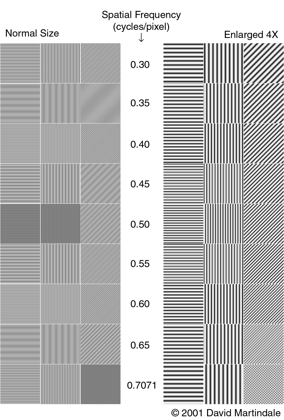
Here's another test image. It shows more clearly that a square sample array has a higher resolution limit for diagonal lines than horizontal and vertical lines.
The left side of the image is samples of horizontal, vertical,
and diagonal lines at spatial frequencies ranging from 0.3 to 0.7 cycles per
pixel. These were generated by a computer program, and represent
theoretically perfect point sampling of sine waves at those frequencies.
To look at the image, it really needs to be displayed at 1:1 (100%) at least,
and even then
you'll probably see some artefacts in the vertical and diagonal lines caused by
interaction with the aperture grille or shadow mask in a CRT. Viewing it
at 200% is better.
You can see that at 0.3 cycles/pixel, you get clear lines with minimal moire-type
effects with any orientation. As you proceed up in frequency to 0.45
cycles/pixel, you start seeing strange things happening in the horizontal and
vertical patterns because you're nearing their resolution limit, while the
diagonal lines remain clean. At 0.5 cycles/pixel you get perfect
horizontal and vertical lines, but only because the frequency matches the pixel
spacing exactly - a small amount less than that frequency
would look really odd.
Once you get above 0.5 cycles/pixel, you can see the effect of aliasing in the
horizontal and vertical lines. 0.55 cycles/pixel and above, the horizontal
and vertical lines do not get closer together, they spread apart again. In
fact, 0.55 is the same as 0.45, 0.6 is the same as 0.4, and so on. But,
meanwhile, the diagonal lines continue getting closer together, because we're
still below the maximum diagonal frequency of 0.7071 cycles/pixel.
However, it's hard to interpret the images on the left because of various
remaining artifacts. To make it clearer to see what is preserved and what
is lost in the images, the patterns on the right side of the image are 4X
enlargements of the ones on the left. These are not theoretically perfect
images calculated at a higher pixel density, they are the actual images on
the left resampled by a real image-resizing program using a high-quality
reconstruction filter. (The filter is a 16x16 pixel Lanczos-windowed sinc
function, which should be the same as one of the better filters in Panorama
Tools).
Because of the resampling, the right-hand images can be viewed at 1:1 on screen
without any artifacts. And it's very clear that 0.5 cycles/pixel is the
maximum horizontal/vertical frequency before aliasing happens, while the
diagonal lines keep getting closer together until 0.7 cycles/pixel.
In particular, look at 0.6 cycles/pixel. At this point, the diagonal lines
are still clean but clearly closer than the horizontal/vertical lines. At
0.65, the diagonals are developing a moire effect, but they're still clearly
closer together than the 0.6 case, and they're still clearly diagonal. At
0.7071, you get the "checkerboard" pattern - the lines are still
perfectly resolved, but you can no longer tell which diagonal direction they
are.