Brightness and Contrast Calibration
[This information used to be at: http://www.jasc.com/support/kb/articles/monitor.asp, but now appears to have been withdrawn since the sale of JASC to Corel. If there is an equivalent link at Corel, I will happily use it rather than copying the information. Until then, I reproduce the information here for the benefit of all those wishing to get the best from their monitors. There is a copy here of the earlier page derived from the WaybackMachine.]
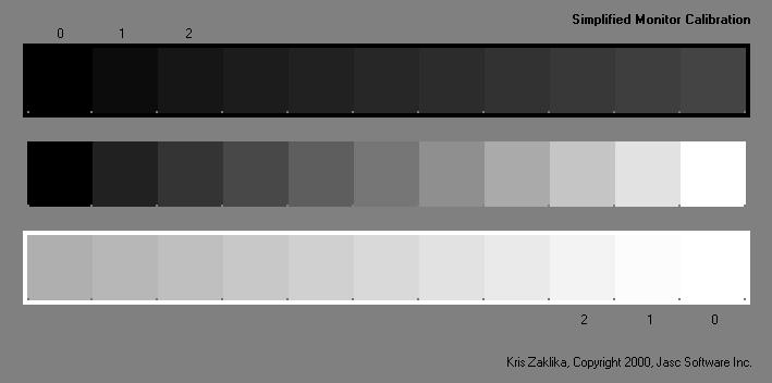
With a properly adjusted monitor, you should be able to distinguish square 1 and 2 from square 0 and the surround for the dark squares at the top and the light squares at the bottom. All the squares in the centre greyscale should be distinguishable and the steps should look evenly spaced. If your monitor doesn't meet this criteria, it needs adjustment. Follow these steps:
- Warm up the monitor for 30-60 minutes. Select subdued room lighting, avoiding reflections of lights or windows on the monitor.
- If using Paint Shop Pro to display the image: Under File > Preferences > Monitor Gamma, set all three colour channels to 1.00.
- Turn the contrast control, usually a half black/half white circle, all the way up.
- Adjust the brightness control, usually a sun symbol, until you can differentiate the dark squares.
- If necessary, adjust the contrast control to differentiate the light squares.
- Mark the control positions and tape the controls in place.